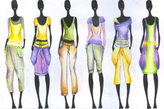
The coloor of this collection is from spilt complementary scheme.
Yellow and green are to create a young, energetic and sharp image.
However, just using these two colors are too bright at all.
Thus, violet is to make contrast and to balance the outfits.
In fact, this is not a easy job to match colours.
Different level of chromas and values provide different effects and feelings.
In my opinions, designers are based on the following factors to match colours :
1) colour trend
2) their favorites ( couture )
3) acceptance level of customers ( commercial )
4) the technology of innovating new colours

沒有留言:
張貼留言